A while back I created a visual map of my music collection by calculating the statistical similarity between the audio waveforms of each track. The algorithm worked quite well but I wasn’t fully satisfied with the visualization approach; the graphic was too crowded and made it hard to see the overall similarity between genres of music.
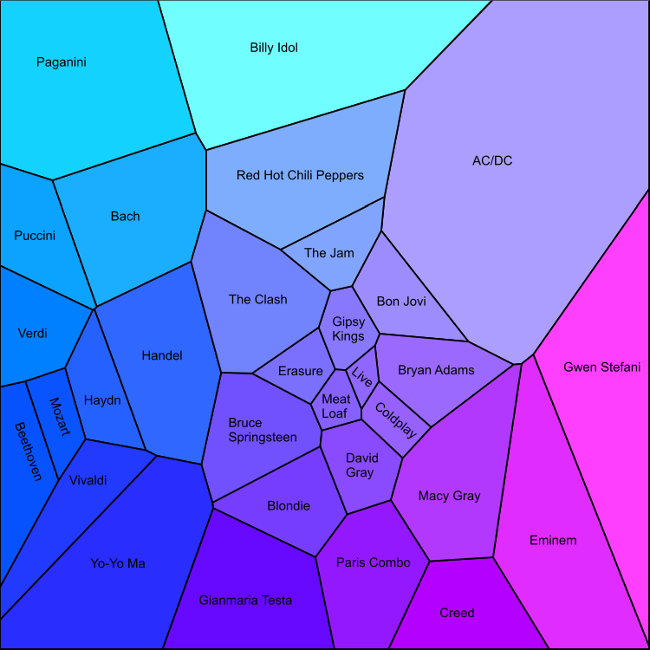
Recently I developed a new and simpler approach that I think gives a more intuitive visualization. Instead of mapping out each song individually, the new approach aggregates all songs from the same artist and then creates a 2D map in which artists from similar genres appear close to each other (e.g. Mozart is next to Beethoven, but far from Eminem). It is fun to look over the map and visually explore which artists the algorithm believes sound most similar to each other.
I’ve often thought music services like Pandora or iTunes could use this idea of a 2D music map to create an awesome user-interface for their music recommendation systems. With all the extra metadata they have about songs they could create very accurate maps. Maybe I’ll get in touch with them to suggest it!
The algorithm to create the map is very simple, and the visualization is also straightforward thanks to the excellent deldir package in R which computes Voronoi tesselations. The only manual step is the labeling of the artists which I did using Xara Photo and Graphic Designer (a great piece of software and good value too). Here are the basic steps:
And here is the final product. Read on to see exactly how it was created.
The first step is to extract statistical features from the waveform of each MP3 file. I covered this step in depth in my earlier article Mapping Your Music Collection so please refer to that page for all the details.
Next we use R to do the dimension reduction, aggregate the resulting points by artist, and plot the Voronoi diagram. Here’s the R code; you can also download the file songdata.csv which contains artist, album, track name, and 42 statistical features for 753 songs by 31 artists.
fs <- read.csv("songdata.csv")

# Extract feature matrix (i.e. remove the first three columns)
f <- fs[, -(1:3)]

# Compute the principal components of the feature matrix
# Note that p$scores contains the actual loadings
p <- princomp(as.matrix(f), cor = TRUE)

# Average the first two principal components of all the songs for each
# artist into a single XY point
d <- aggregate(p$scores[, 1:2], by = list(artist = fs$artist), mean)
names(d) <- c("artist", "x", "y")

# Define the color of the region for each artist.
# First scale the X and Y coordinates of the artists to lie in [0, 1]
scale01 <- function(x) (x - min(x)) / (max(x) - min(x))
xs <- scale01(d$x)
ys <- scale01(d$y)
# Then use these as the Red and Green components, with Blue fixed at 1
artist_color <- rgb(xs, ys, 1)

# Set up a new graphics window with no borders
dev.new(width = 10, height = 10)
par(mai = c(0, 0, 0, 0))

# Draw an empty plot
plot(d$x, d$y, type = "n")

# Load the deldir package to perform Voronoi tesselations
library(deldir)

# Compute and plot the Voronoi region for each artist
regions <- tile.list(deldir(d))
for(k in 1:length(regions)) {
  polygon(regions[[k]], col = artist_color[k], lwd = 2)
}
The last step is to add the artist labels. You can do this programmatically in R but they won’t align nicely with the edges of the regions so instead I added them manually using Xara Photo and Graphic Designer.
The final bitmap is shown above, but since everything in this visualization is made up of lines and polygons it also produces a nice resolution-independent PDF file (available here).