Mapping Your Music Collection
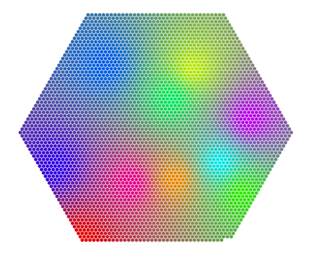
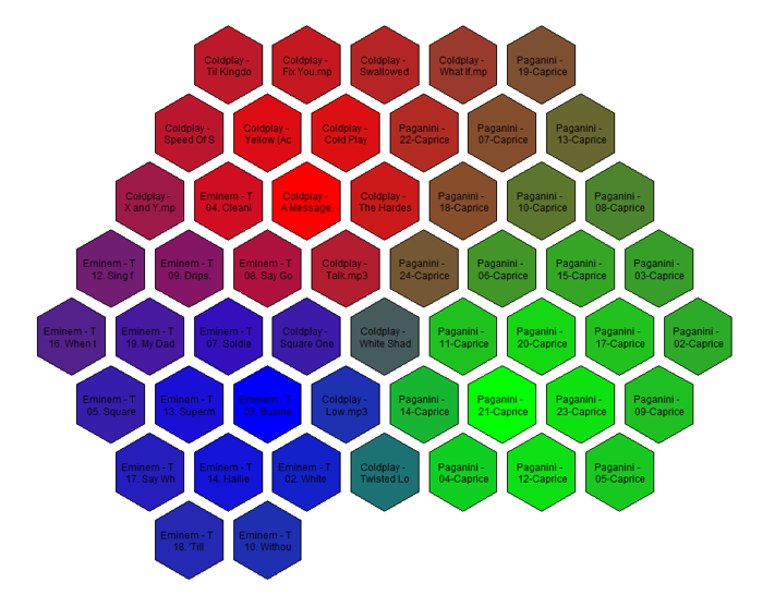
In this article we’ll explore a neat way of visualizing your MP3 music collection. The end result will be a hexagonal map of all your songs, with similar sounding tracks located next to each other. The color of different regions corresponds to different genres of music (e.g. classical, hip hop, hard rock). As an example, here’s a map of three albums from my music collection: Paganini’s Violin Caprices, Eminem’s The Eminem Show, and Coldplay’s X&Y.
To make things more interesting (and in some cases simpler), I imposed some constraints. First, the solution should not rely on any pre-existing ID3 tags (e.g. Arist, Genre) in the MP3 files-only the statistical properties of the sound should be used to calculate the similarity of songs. A lot of my MP3 files are poorly tagged anyways, and I wanted to keep the solution applicable to any music collection no matter how bad its metadata. Second, no other external information should be used to create the visualization-the only required inputs are the user’s set of MP3 files. It is possible to improve the quality of the solution by leveraging a large database of songs which have already been tagged with a specific genre, but for simplicity I wanted to keep this solution completely standalone. And lastly, although digital music comes in many formats (MP3, WMA, M4A, OGG, etc.) to keep things simple I just focused on MP3 files. The algorithm developed here should work fine for any other format as long as it can be extracted into a WAV file.
Creating the music map is an interesting exercise. It involves audio processing, machine learning, and visualization techniques. The basic steps are as as follows:
- Convert MP3 files to low bitrate WAV files.
- Extract statistical features from the raw WAV data.
- Find an optimal subset of these features such that songs which are “close” to each other in this feature space also sound similar to the human ear.
- Use dimension reduction techniques to map the feature vectors down to two dimensions for plotting on an XY plane.
- Generate a hexagonal grid of points then use nearest neighbor techniques to map each song in the XY plane to a point on the hexagonal grid.
- Back in the original high-dimensional feature space, cluster the songs into a user-defined number of groups (k=10 works well for visualization purposes). For each cluster, find the song closest to the cluster center.
- On the hexagonal grid, color the songs corresponding to the k cluster centers with different colors.
- Interpolate the colors for other songs based on their proximity in the XY plane to each cluster center.
Let’s look at some of these steps in more detail.
Convert MP3 files to WAV format
The main advantage of converting our music into WAV format is that we can use the wave module in Python’s standard library to easily read in the data for manipulation with NumPy. We will also downsample the sound files to mono 10kHz to make the statistical feature extraction less computationally intensive. To handle both the conversion and downsampling I used the well-known MPG123. This is a freely-available command line MP3 player which can be easily called from within Python. The code below recursively searches through a Music folder to find all MP3 files, then calls MPG123 to convert them to a temporary 10kHz WAV file. The feature computation code (covered in the next section) is then run on this WAV file.
import subprocess
import wave
import struct
import numpy
import csv
import sys

def read_wav(wav_file):
    """Returns two chunks of sound data from wave file."""
    w = wave.open(wav_file)
    n = 60 * 10000
    if w.getnframes() < n * 2:
        raise ValueError('Wave file too short')
    frames = w.readframes(n)
    wav_data1 = struct.unpack('%dh' % n, frames)
    frames = w.readframes(n)
    wav_data2 = struct.unpack('%dh' % n, frames)
    return wav_data1, wav_data2

def compute_chunk_features(mp3_file):
    """Return feature vectors for two chunks of an MP3 file."""
    # Extract MP3 file to a mono, 10kHz WAV file
    mpg123_command = '..\\mpg123-1.12.3-x86-64\\mpg123.exe -w "%s" -r 10000 -m "%s"'
    out_file = 'temp.wav'
    cmd = mpg123_command % (out_file, mp3_file)
    temp = subprocess.call(cmd)
    # Read in chunks of data from WAV file
    wav_data1, wav_data2 = read_wav(out_file)
    # We'll cover how the features are computed in the next section!
    return features(wav_data1), features(wav_data2)

# Main script starts here
# =======================

for path, dirs, files in os.walk('C:/Users/Christian/Music/'):
    for f in files:
        if not f.endswith('.mp3'):
            # Skip any non-MP3 files
            continue
        mp3_file = os.path.join(path, f)
        # Extract the track name (i.e. the file name) plus the names
        # of the two preceding directories. This will be useful
        # later for plotting.
        tail, track = os.path.split(mp3_file)
        tail, dir1 = os.path.split(tail)
        tail, dir2 = os.path.split(tail)
        # Compute features. feature_vec1 and feature_vec2 are lists of floating
        # point numbers representing the statistical features we have extracted
        # from the raw sound data.
        try:
            feature_vec1, feature_vec2 = compute_chunk_features(mp3_file)
        except:
            continue
Feature Extraction
A mono 10kHz wave file is represented in Python as a list of integers ranging from -254 to 255, with 10,000 integers per second of sound. Each integer represents the relative amplitude of the song at that point in time. We will take two 60 second clips from each song, so each will be represented by a list of 600,000 integers. The read_wav function in the code above returns these lists. Here’s a plot of 10 seconds of sound from four songs on Eminem’s The Eminem Show:
And for comparison, here are clips from four of Paganini’s violin caprices:
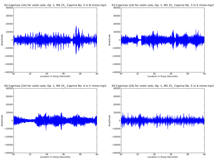
There are some pretty clear differences in the structure of those waveforms, but in general the Eminem songs all look somewhat similar to each other, as do the violin caprices. We will now extract some statistical features from these waveforms that will capture those differences and let us apply machine learning techniques to group together songs by how similar they sound to the human ear.
The first set of features we’ll extract are statistical moments of the waveforms (mean, standard deviation, skewness and kurtosis). In addition to computing these on the raw amplitudes, we’ll also compute them on increasingly smoothed versions of the amplitudes to capture properties of the music at various timescales. I used smoothing windows of 1, 10, 100 and 1000 samples, but it is certainly possible that other values would give good results too.
All the quantities above were computed on the amplitudes themselves. To capture the short term changes in the signal, I also computed these statistics on the first-order difference of the (smoothed) amplitudes.
The features above give a pretty comprehensive statistical summary of the waveforms in the time domain, but it is also useful to compute some frequency domain features. Bass heavy music like hip hop will have a lot more power in the lower end of the spectrum, whereas classical music has a greater proportion of its energy in the higher frequency bands.
Putting this all together gives us 42 different features for each song. Here’s the Python code to compute these features from a list amplitudes:
def moments(x):
    mean = x.mean()
    std = x.var()**0.5
    skewness = ((x - mean)**3).mean() / std**3
    kurtosis = ((x - mean)**4).mean() / std**4
    return [mean, std, skewness, kurtosis]

def fftfeatures(wavdata):
    f = numpy.fft.fft(wavdata)
    f = f[2:(f.size / 2 + 1)]
    f = abs(f)
    total_power = f.sum()
    f = numpy.array_split(f, 10)
    return [e.sum() / total_power for e in f]

def features(x):
    x = numpy.array(x)
    f = []

    xs = x
    diff = xs[1:] - xs[:-1]
    f.extend(moments(xs))
    f.extend(moments(diff))

    xs = x.reshape(-1, 10).mean(1)
    diff = xs[1:] - xs[:-1]
    f.extend(moments(xs))
    f.extend(moments(diff))

    xs = x.reshape(-1, 100).mean(1)
    diff = xs[1:] - xs[:-1]
    f.extend(moments(xs))
    f.extend(moments(diff))

    xs = x.reshape(-1, 1000).mean(1)
    diff = xs[1:] - xs[:-1]
    f.extend(moments(xs))
    f.extend(moments(diff))

    f.extend(fftfeatures(x))
    return f

# f will be a list of 42 floating point features with the following
# names:

# amp1mean
# amp1std
# amp1skew
# amp1kurt
# amp1dmean
# amp1dstd
# amp1dskew
# amp1dkurt
# amp10mean
# amp10std
# amp10skew
# amp10kurt
# amp10dmean
# amp10dstd
# amp10dskew
# amp10dkurt
# amp100mean
# amp100std
# amp100skew
# amp100kurt
# amp100dmean
# amp100dstd
# amp100dskew
# amp100dkurt
# amp1000mean
# amp1000std
# amp1000skew
# amp1000kurt
# amp1000dmean
# amp1000dstd
# amp1000dskew
# amp1000dkurt
# power1
# power2
# power3
# power4
# power5
# power6
# power7
# power8
# power9
# power10
Selecting an Optimal Subset of Features
We’ve computed 42 different features but not all of them will be useful for deciding whether two songs sound the same. The next step is to find an optimal subset of these features which work well together so that in this reduced feature space the Euclidean distance between two feature vectors correlates well with how similar two songs sound to the human ear.
This process of variable selection is a supervised machine learning problem so we need a set of training data that can help guide the algorithm towards finding the best subset of variables. Instead of manually going through my music collection and marking down which songs sound similar to create a training set for the algorithm, I used a much simpler approach: take two 1 minute samples from each song and try to find an algorithm that does the best job of matching the two samples from each song together.
To find the set of features that gives the best average match across all songs I used a genetic algorithm (the genalg package in R) to switch on and off each of the 42 variables. The plot below shows the improvement in the objective function (i.e. how reliably a song’s two samples are matched together by the nearest neighbor classifier) over 100 generations of the genetic algorithm.
If we had forced our distance function to use all 42 features the value of the objective function would have been 275. By judicious use of a genetic algorithm to select variables we have reduced the objective function (i.e. the error rate) down to 90, a significant improvement. The optimal set of features was found to be:
- amp10mean
- amp10std
- amp10skew
- amp10dstd
- amp10dskew
- amp10dkurt
- amp100mean
- amp100std
- amp100dstd
- amp1000mean
- power2
- power3
- power4
- power5
- power6
- power7
- power8
- power9
Visualize Data in Two Dimensions
Our optimal set of features uses 18 variables to compare the similarity of songs but ultimately we want to visualize our music collection on a 2D plane, so we need to project this 18-dimensional space down into two dimensions for plotting. To do this I simply used the first two principal components as the x and y coordinates. This will of course introduce some errors into the visualization so that some songs which appear “close” to each other in the 18-dimensional space are not as close in the 2D plane. These errors are unavoidable, but thankfully they do not distort the relationships too badly-similar sounding songs still cluster together into roughly the same region of the 2D plane.
Map Points to a Hexagonal Grid
The 2D points generated from the principal components are irregularly spaced on the plane. Although this irregular spacing represents the most “accurate” placement of the 18-dimensional feature vectors in 2D, I was willing to sacrifice some of this accuracy to map them onto a cool looking, regularly spaced hexagonal grid. This was accomplished by:
- Embedding the xy points inside a much larger hexagonal grid of points
- Starting with the outermost points on the hexagon, assign to each hex grid point the nearest irregularly spaced principal component point.
- This stretches out the 2D points so they completely fill the hexagonal grid and make an attractive plot.
Color the Plot
One of the main goals for this exercise was to make no assumptions about the content of the music collection. That meant I did not want to assign pre-defined colors to certain musical genres. Instead, I clustered the feature vectors in 18-dimensional space to find pockets of similar-sounding music and then assigned colors to those cluster centers. The result is an adaptive coloring algorithm which will find as much detail as you ask of it (since the user can define the number of clusters and hence colors). As mentioned earlier, I found that using k=10 for the number of clusters tends to give good results.
Final Output
Just for fun, here is a visualization of 3,668 songs in my music collection. The full resolution image is available here. If you zoom in you will see that algorithm works quite well: the colored regions correspond to tracks from the same genre and usually the same artist, as we would hope.